
Sonoran Prevention Works
Sonoran Prevention Works is a harm reduction services provider that focuses on street-based outreach, organizational capacity building, and state-wide advocacy work. Their growth, accomplishments, and credibility weren’t reflected in their brand or website. They needed a warm, vibrant brand that reflected their values and an updated website that would help folks connect with them more easily.
Project Type
Brand Identity
Website Design
Website Development
Collaborators
- Tory Howell: Creative Direction, Lead Designer, Lead Developer
Discover
Learning about SPW
Listening Sessions
We facilitated multiple listening sessions with each of SPW's major stakeholder groups: staff and community members.
The listening sessions with staff helped us understand their technical needs including functionality that can help them do their jobs more easily.
Listening sessions with community members helped us understand how folks look for and find information about drugs and harm reduction. This information was vital to our ability to make the site a useful tool for participants.
Website Analysis
We dug into the previous SPW website to understand the content, how it was being visited by users, and identify areas of opportunity to improve accessibility.


Key Findings
1
When SPW was younger, they felt the need to appear “professionalized” in order to be taken seriously by public health officials (and not be harassed by law enforcement). Now, SPW wants their brand to align more closely with who they are on the inside - scrappy, a bit radical, and down to earth.
2
Staff want the website to function more as a tool. They want visitors to be able to find more information on the website and need to call into the office less.
3
The website should be first and foremost for people who use drugs (PWUD). It should prioritize resources and services, rather than information about SPW.
Define
Connecting organization goals to project goals
Organization
Project
Shift primary audience to focus more on participants and deprioritize appealing to public health officials (without alienating them)
Create a brand that aligns with SPWs true identity: scrappy, a bit radical, and down to earth.
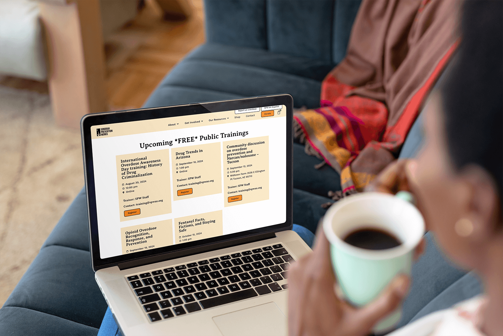
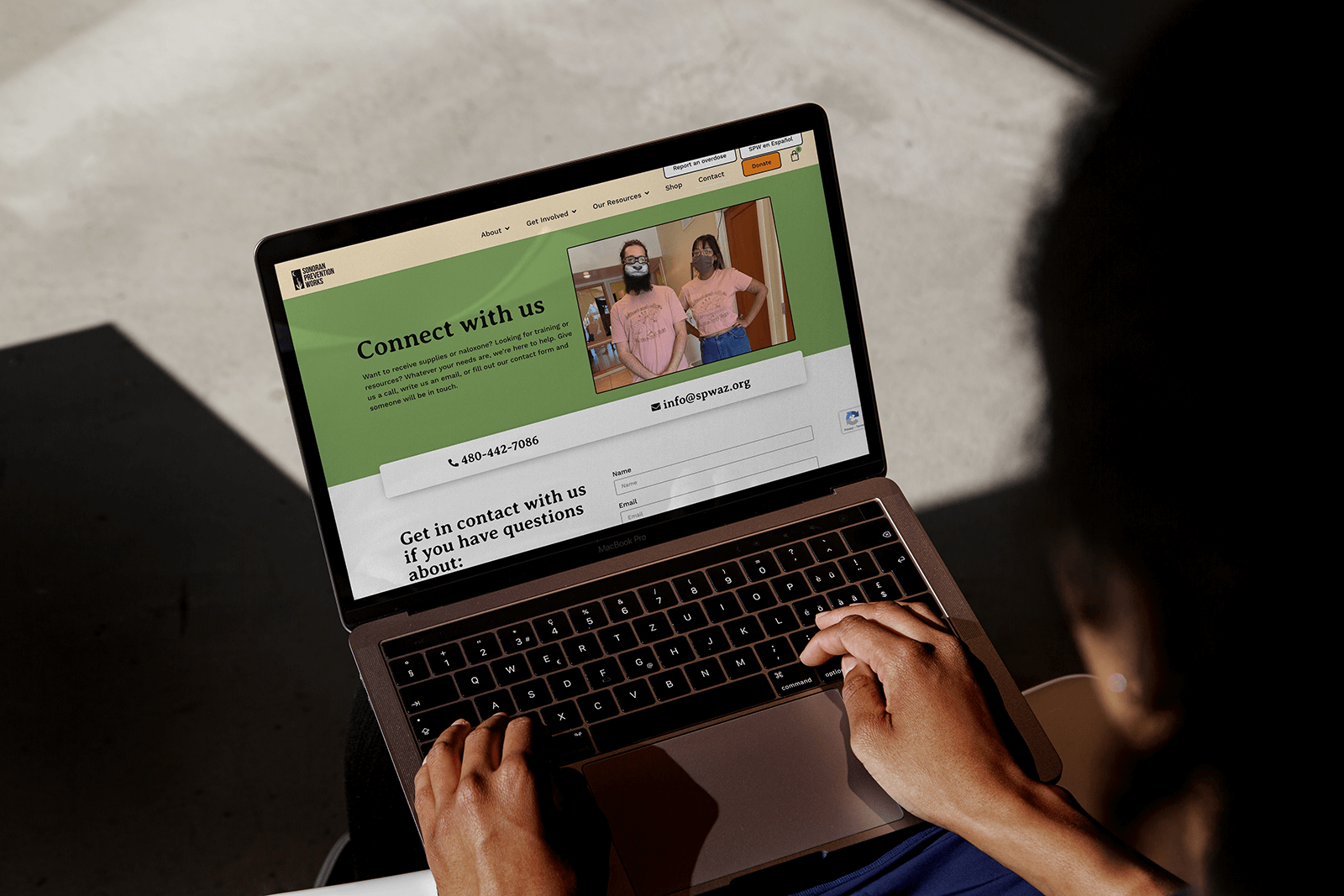
Build a website that prioritizes resources & services rather than information about SPW.
Add functionality to the website that helps staff save time.
Develop
Create a brand that aligns with SPWs true identity
SPW’s existing brand had some strengths and weaknesses. The biggest strength was that the brand’s primary orange color was distinctive and recognizable. However, it wasn’t always used in an accessible way. In general, the brand lacked definition and clarity which made it hard to be consistent. This also meant that there wasn’t a clear personality.
Our main goal was to create a visual identity that more closely aligned with the spirit of SPW, while also ensuring the brand is easy to work with for in-house communications and development staff. We kept the logo the same and built out a more expansive color palette, typography stack, patterns, and image treatments.


Headlines - Averia Serif Libre

Body Copy - Work Sans

Accents - Courier

Color
Patterns


Develop
Build a website that prioritizes resources & services
We created a multi-language website that highlights the stories of PLAN’s clients. It includes a resource center with resources in English and Spanish, a way for visitors to ask legal questions, and has a focus on mobile device accessibility for folks who are visiting the site on government phones.


Outcomes
The new website increased average user engagement time by 50%. A new, more clear sitemap, more higher quality information, and an improved user experience encourage people to explore the site for longer.
Design templates improved the agility of communications staff. Prior to the redesign, all deliverables were made on an as needed basis. As part of the redesign, we created templates for slide decks, brochures, flyers, social media graphics, and more. This allowed staff to be less reliant on external design services.